Office Interior | US Data Corporation | Randy Brown Architects

This Los Angeles based company requested an energizing new identity for their satellite office.  RBA collaborated with award winning interior designer Rebecca Herdzina and Allmakes Office Equipment to create a state of the art data center for $28.00 a square foot.

AIA National Honor Award Interior Architecture....more

Retail Interior | Belfry Tashkent | Ippolito Fleitz Group


The city of Tashkent just celebrated its 2,200th birthday, but the Uzbek capital, once a stop on the Silk Road, has retained little of its ancient architecture. In 1966, a 5.0-magnitude earthquake mostly leveled the city’s historic center of clay-brick buildings. The Soviet Union rebuilt with modern structures lining wide boulevards. But in the decades since Soviet rule, the Uzbek government has redeveloped the area with an eye toward bringing traditional ornamentation back to the city’s architecture while creating a sophisticated capital that embraces an international brand of contemporary design.

One of its recent efforts, the International Forums Palace, anchors a prominent site on Tashkent’s Amir Timur Square. A large convention hall — and an outward-looking public face for Uzbekistan — it was designed by a local team, but officials decided to bring in Stuttgart-based Ippolito Fleitz Group for the interiors. Pleased with the result, officials also asked the German firm to design interiors for the adjacent Belfry Tashkent, a 3,600-square-foot retail space selling traditionally made jewelry, housed in a re-created historic bell tower....more

College Interior By Alsop | Sharp Centre for Design / OCAD


Toronto, Canada
Project Status: Completed 2004
GFA (sqm): 7,800
Client: Ontario College of Art and Design

A distinctive cultural force in Ontario, OCAD’s impetus to expand comes with a growing recognition at national level of the contribution of the creative industries to Canada’s modern economy. The decision to employ Alsop was based upon a significant track record in the design of cultural buildings of enduring effectiveness and appeal which also offered iconic representation of the client body as the school enters a new age.

Following the appointment to the project, Alsop instigated a series of client workshops in which early concepts were developed with college staff and students. During this time, conventional ideas of teaching, learning and architecture were explored as the group sought to redefine their new college of art and design. The participants of the workshops exchanged sketches and ideas that lead to the development of a basic strategy. These original ideas are embodied in the final scheme, a flying, translucent rectangle or ‘table top’ vividly patterned with a colourful pixellated skin, raised eight storeys from the ground and housing the new Faculty of Design.

The project unifies the existing brick structures beneath the ‘table top’, the park to the west and McCaul Street to the east. Views to the park are preserved for OCAD’s neighbours across McCaul Street, who participated in the consultation process. The park will also benefit from the area’s regeneration and, restored, will be the home to contemporary sculpture and school events.

Programming works in collaboration with OCAD and Alsop have accommodated all the elements of a complex client group. In addition to the teaching and administrative spaces the project also incorporates gallery spaces, design and research centres, lounge and meeting rooms, specific craft and metalwork workshops and design critique spaces.

The college satisfies its aspirations to revive a neglected area of town by inviting in the public to visit galleries and cafe spaces in the new building. OCAD contributes distinctive design and revived public areas, internal and external to this quarter of the city.....more

Retail Interior By Hayon Studio | Faberge Salon


The interior of the Faberge boutique presents an innovative approach to the High Jewellery experience, with its expression of modern luxury through simplicity and sensuality. The concept and design focuses on superlative craftsmanship, sensually minimal shapes and forms, and exquisite materials, including silk wall drapes, rare woods and Carrara marble. The materials used give the boutique an organic and dynamic feel balanced by a serenity that comes from the tonality of neutral, silvered metallic shades. Light and luminosity that flood the boutique form the central theme of Hayon’s interior design. Simple open spaces are bathed in the reflections of mirrors and in outside light that drifts through the tinted glass of cut-out gem-shaped panels in tall interconnecting doors.....more

Retail Interior By Issho | Tokyo, Japan


Shop interior project for an independent Tokyo fashion brand. The entrance door is made of plywood boards layered with shades ranging from white to dark blue. The shop floor is painted with a white base coast and dark blue on top. As the floor wears down over time, the blue fades and the white emerges, creating an impression of watery depth.....more

Exhibition Interior | The Good Life | WORKac


A design for a Van Alen Institute exhibition about new urban public spaces. Projects were divided into five themes: The Fun City, The Healthy City, The Cultured City, The Connected City and The 24—Hour City. A single gesture – the wiggle - creates a series of discrete and varied environments for the themes, along with a stage for events and a lounge. The wiggle was created from a sinuous band of fabric, manipulated to create openings, windows for video screens and areas to gather and sit. In collaboration with graphic designers Project Projects....more

Shopping Mall Interior | M & S Swansea by Urbansalon

M&S Swansea is M&S's second clothing-only retail park store, after Speke. Exposed ductwork and a void near the front maximises the impact of the double-height space.
Centrally located escalators and an illuminated perimeter wall around each shop floor makes navigation easy. A clean white balustrade running across the front of the mezzanine adds clarity between the floors. The café is indicated by a break in the balustrade. Different “fields” of lighting distinguish departments at a glance and create different moods throughout the store. Clothing is laid out in fashion stories that put customers at the centre.
Music and large-scale photography add drama.All aspects of the shopping environment have been redesigned to create a fashion-led experience. New graphics, introduce a more friendly tone of voice and a soft fabric basket replaces the wire mesh basket. Conceived as pieces of furniture, the service points are generous to the customer and stylish. Changing rooms are striking and intimate.
Contemporary materials and furniture such as Barrisol, Birdwing, the Mooi Monkey ball light and the Maarten Van Severen .03 chair have been used. Many elements of the design are bespoke including the finish of the poured resin flooring, the lingerie, womenswear, menswear and kidswear lights and the customer seating.The store is successfully attracting new customers as well as core customers. It is selling proportionately more of the younger styles and has a high level of repeat customers. In its first two months of trading, the store has generated two and a half times the weekly sales of a comparable M&S store on a retail park.

The design of the store and its sister shop in Speke will form the template for the future roll-out of the M&S stores...more
Awards
Retail Week June 2005
Frame 41 2004 article
Independent on Sunday May 2007

Bar Interior | Numero Bar | Sao Paulo, Brazil | Isay Weinfeld arquiteto

Numero bar was built on a very narrow and long strip of land in the Jardins area, in São Paulo.

A walkway runs from the street through a hallway/tunnel fully covered in mirrors, leading to the main hall.

At the Numero bar entrance, the ceiling is extremely low and the view of the hall – cascaded – is unimpeded. Progressing towards the back, the height gradually increases: descending levels feature comfortable lounging areas, under a ceiling that extends on a continually rising surface.

The low and indirect lighting throughout Numero bar lends the ambience a pleasant and cozy atmosphere, perfect for a relaxing drink at the end of the day, accompanied by friends and to the sound of good music.

A room reserved for private functions takes up the lower floor of Numero bar and, contrary to the main hall, features a low ceiling all along, with couches placed in the central axis of the room, built-in overhead lighting throughout, and walls completely covered by antique posters or poster fragments.
More images here

Club Interior | Privium Clublounge | Schiphol Airport, Amsterdam | M+R interior architects |


Architect's statement

Frequent fliers to Amsterdam Airport Schiphol might already be familiar with the name of Privium and the benefits of membership, for the rest it can be defined as a “select way to travel” based on priority airport services, such as preferential parking, discounted valet parking, business class check-in, the preferential Privium-only route to a secure area beyond the customs checkpoint via a quick iris scan and now the much-awaited members-only lounge.
Following an international competition, Privium Schiphol appointed the young design bureau at M+R interior architects from Eindhoven to design their highly exclusive ClubLounge located between Departure Halls 1 and 2. Once passengers have reached the “eye”, which is literally a door shaped like a pupil that opens to provide access, they are invited to experience the comforts of every imaginable travel amenity from a fully stocked bar to a Light Energy Cabin intended for battery recharging, as well as complimentary food, computer workstations and business services. The ambiance is relaxing and aesthetically pleasing to the tired traveler’s eye, no pun intended, with an all-white décor, colorful sitting areas and giant organic shapes mixed in with well-chosen design classics to set the mood.

As Privium claims, “Life’s not about the destination. It’s about the journey”. And this journey involves a stop at the lounge.....more

Cafe Interior | Sweet Chill, City Center, Las Vegas | Karim Rashid

Like a swirl of ice cream, the MGM Gelato is one continuous gesture throughout the space, with flowing ribbons of form from floor to wall to ceiling. Soft colorful chairs complement these ribbons highlighting the tasty treats in store for guests. The curvy and sensuous space becomes a natural-looking yet distinctive extension of its surroundings.

Client: MGM Mirage
Facilities: 64 seat cafe and gelateria
Area: 250 sqm
More at Karim Rashid

Restaurant Interior | Fabbrica | Rotterdam | Tjep


Description
After the success of restaurant Praq, one of our favorite clients commissioned a new restaurant to be located in the Rotterdam harbor, right between the boats and the cranes. Fabbrica struck us as the most convenient name for this new Italian restaurant.
Fabbrica meaning factory in Italian, we envisioned the canteen of a very special factory: a very romantic factory where pleasure is produced for guests.
Like in the canteen of a factory you will find long tables and benches at Fabbrica, but than colored in Italian ice-cream shop style colors: pink and pistachio green.
The oven is placed in a huge tank, covered with italian mosaic. A large wall composed of crane elements is used to store wood to fire the oven.
Every detail combines industrial sturdiness with soft colors or decorative elements. We chose not to intervene with the authentic industrial character of this nineteenth century warehouse so we left all the structures in original state.
The walls for example are left intact, in several places large glass panels were placed in front of them covered with Italian wallpaper patterns. The result is that the patterns seem to float in front of the wall in a complex game of reflections.
Lovers get to sit in a train structure that floats in the center of the space. The logo of Fabbrica is based on a font in which the point on the i resembles the beautiful shape of a hand made pizza, but one can also see a full moon, as it enlightens Fabbrica at night.


Photography
Daniel Nicolas

Interior and identity design by Tjep.

Retail Interior | Camper Shop Tokyo | Hayon Studio


Inspired by classic circus elements, this new project for Camper has colour and fantasy. The space is full of life and light, inviting people to dream. As soon as we step through the organic door, with a handle shaped like a candy cane, we begin to discover the surprises inside. There are no corners, only curved forms. There is an interesting contrast between the walls covered in Bisazza mosaic tiles, perfect and delicate, and the cement floor, basic and unfinished. The long, narrow centre table resembles a centipede. The coloured mirrors placed on the ceiling elongate perspective and give the store added warmth. These small touches of quality do not go unnoticed. The special areas are separated by bevelled glass panels reminiscent of cut gemstones. Colour filters create a magical transparency. The shop is fresh and elegant.......more at Hayon Studio

Shopping Mall Interior | Raffles City Singapore | Sparchasia


Location: Singapre
Project Status: Completed in 2008
GFA (sqm): RIL Office:1810, Phase 4 and 5: 8000, Phase 2A: 514.
Client: CapitaLand Commercial Ltd

Constructed over a number of separate phases to maintain the operation of the existing shopping mall the project ambition is to generally upgrade the quality of the shopping experience internally and externally and provide significant further rentable floor area.

Existing basement parking floors were decanted and turned into shopping floor and new pavilions were constructed inside and out side the building adding a total of 6,000m2 rental space to the building. Future phases as part of a building wide masterplan will be completed in due course.

Bank Interior | "Private Banking" Zentrale | Frankfurt , Germany | Wittfoht Architekten


Situation:
The particular task and the particular situation of BHF-Bank in central Frankfurt are very close to the Alte Oper, the defining moments for our design of the new private banking sector.
The buildings of the Bank was in the sixties by Sep Ruf, one of the most important post-war architects in Germany, designed and implemented. The complex consists of three parts of the building, the flat atrium, connecting the central block and the 23geschossigen skyscraper. The central building is located along the upper road, separating it from Lindau Rothschild Park. At the upper Lindau is a spacious driveway, on reaching the main entrance. From the main entrance that opens into the atrium or via a lift system in the floors of the intermediary. This situation is to receive in connection with the newly created private banking division, which will occur on the ground and 1st floor of the central building, to be reorganized and made more.
In future, to move into the renovated office area and meeting rooms, and held small receptions and events at a high level. Optionally, this area expanded to include the event parkseitige terrace.

Design approach:
The newly designed access situation is to function as a generous reception and distribution area, without disturbing installations. A transparent porch, the visitor reaches the customer or in the open-plan reception area. Today's uninviting security gate will be replaced by a light reception desk. This bar not only meets the functional criteria necessary but is also physically very important. It connects and manages the reception area in the new "private banking hall. In the private banking sector is from the reception desk open a customer switch.
Ceiling glazing are the climatic barrier between the entrance and the atrium hall and entrance hall and the new "private banking hall. A series of floor to ceiling vertical blinds with Glaszwischenfeldern creates the geographical limits of the new clients in private banking hall. The vertical wood slats and divide the space between the separate meeting rooms and the hall. Like a second inner skin, they provide the necessary functional separation to close but spatially. This ensures that the desired relation between interior and exterior preserved. This idea is strengthened by the more upstream event parkseitig terrace. This can take place in the summer of customer events.
The terrace is part of the newly designed Rothschild Park. The facade in this area can be opened a large area. The banking hall itself serves as a prestigious reception and waiting area. A large spiral staircase, like a sculpture, connects the ground floor with the 1st floor, which houses most of the consultancies. They too should be restructured and adapted to the architectural appearance. The corridor walls are designed as a glass timber stud walls. The room walls are designed as plasterboard walls with integrated glass skylights. The central zone is widened and next to the spiral staircase are two more make it round gallery openings for the spatial link between the ground floor and 1st floor. Thus the two levels are not only functional but also spatially linked. In the basement of the existing security cameras is being remodeled. The private individual passes through the Paternoster (elevator) from the ground floor in the 1.Untergeschoss. Here he met a representative entrance hall, which is upstream of the actual vault. The safe itself is replaced by a new in the lockers, the corresponding bank, interior concept are embedded.

Materials:
The external materials used preserved in character and color.
In developing high-quality materials are used. The entrance is complemented by a porch. The soil is consistently kept in dark stone. The reception desk is made of a light lacquer surface and leads to the foyer in the customer area of "private banking on." The central service area will be taken through floor to ceiling slats of wood, behind which are the meeting rooms and offices. Carpet Islands, the loosely stacked on the floor, define the individual sitting areas. They can be removed if necessary, for example for reception.
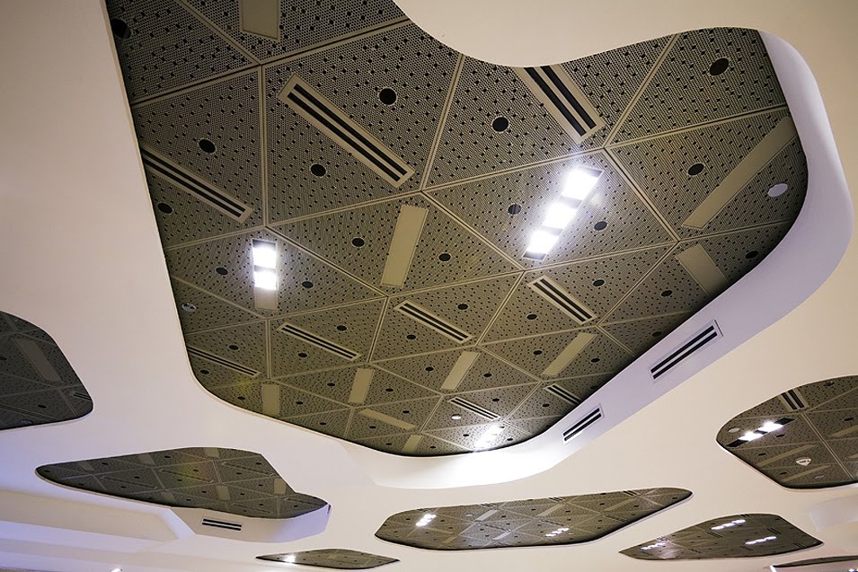
The space-shaping power of light plays a very special significance. Three large, round ceiling penetrations shall geschossübergreifenden with light installations for an intimate and balanced lighting situation. Down Lights emphasize height and rhythm of the blades and thus their importance for the room.

Conclusion:
In addition to the special importance of the place it is the interaction of man - light - space and matter, which will determine the effect of the new "private banking division.
Our design is expressed in its system - from the plan to the individual items inside - a formal simplicity in interior design and material.
The "private banking" services creates this new spatial relationships and connections between inside and outside. He linked and thereby underlines the importance of place.

More at Wittfoht Architekten and Architonic

Kindergarten Interior | Kindergarten Sighartstein,Land Salzburg | kadawittfeldarchitektur


The concept of the “kindergarten-in-motion” includes the surrounding area of unspoilt nature. The building can be explored in different ways by a vertical and horizontal three-dimensional network. The design of the building is developed from two horizontal layers that surround a central hall and courtyard. The two L- and U-shaped levels result in an open, multilayer structure. They become the floor, ceiling, roof and gallery for the rooms of the kindergarten, and outside they form a terrace and playground “ramp.” The spatial structure creates new views and invites the children to move within indoor and outdoor areas. The central hall is multifunctional, and the patio and the dining hall can be opened so the outdoor area can “flow” deep into the building.

 Location:
Sighartstein, Land Salzburg (AT)
Construction Volume:
GFA 957 m², cubature 3962 m³
Client:
Stadt Neumarkt
Realization:
2007 -
Competition:
2004 - 1st Prize

More at kadawittfeldarchitektur

Restaurant Interior | Peach House Restaurant | San Gabriel,United States | MAKE Architecture


The Peach House project, located in a commercial center at the corner of Valley Blvd and New Ave in San Gabriel was an opportunity for MAKE to inject a simple architectural move in a small space in the form of repetitive ribs that punctuate at the customer counter with vibrant color.

When entering the frozen yogurt shop, the customer encounters high gloss white repetitive “rings” that define the spatial extent of the walls and ceiling. To accomplish this, MAKE utilized both sheet mdf (at floor + ceiling) and flexible mdf (where wall meets ceiling). The resulting forms, taking the same angle at the ceiling as the walls, create a louvered effect that terminates at the service area. Where tables/seating and the customer counter occurs, these rings take a more sinuous form, peeling away from the wall to provide flat usable surfaces while maintaining the overall aesthetic of the “ribs” where they occur. At the customer counter, the area below the peeled away “rib” receives a piece of laminated glass with a rich yellow color consistent with the family of yellows adjacent in the service area. Where the “rib” peels away from the wall to become a customer table, the peeled away “rib” floats. Upon leaving the customer counter and turning around, the customer is aware of the illuminated color spectrum emerging from behind the high gloss white rings, ranging from a rich yellow to a deep red at the exterior storefront.

MAKE was also responsible for the Peach House logo and menu design. The logo, a series of rectangular rings one inside the other by way of forced perspective, was designed to be in concert and referential to the interior design, thus furthering the idea of total environment package.

Design team: Project Designers: Jess Mullen-Carey + Bill Beauter Electrical Engineer: Jacob Chan of MDC Engineers Glazing Consultant: Philip Vourvoulis of GlasPro Photography: John Edward Linden

Client: Charlene Chiu + Kai Liang
Via
Related Posts Plugin for WordPress, Blogger...